
Deep Umber With Veiled Indigo Undertones
Deep umber with veiled indigo undertones brings to mind a color that feels both grounded and mysterious. I see this shade as one that blends earthy comfort with a hushed hint of something more enigmatic. It looks almost black at night, yet comes alive in daylight with an inky, cool blue-purple touch. This color isn’t easy to pin down, making it intriguing for artists, designers, and anyone who wants a truly unique palette.
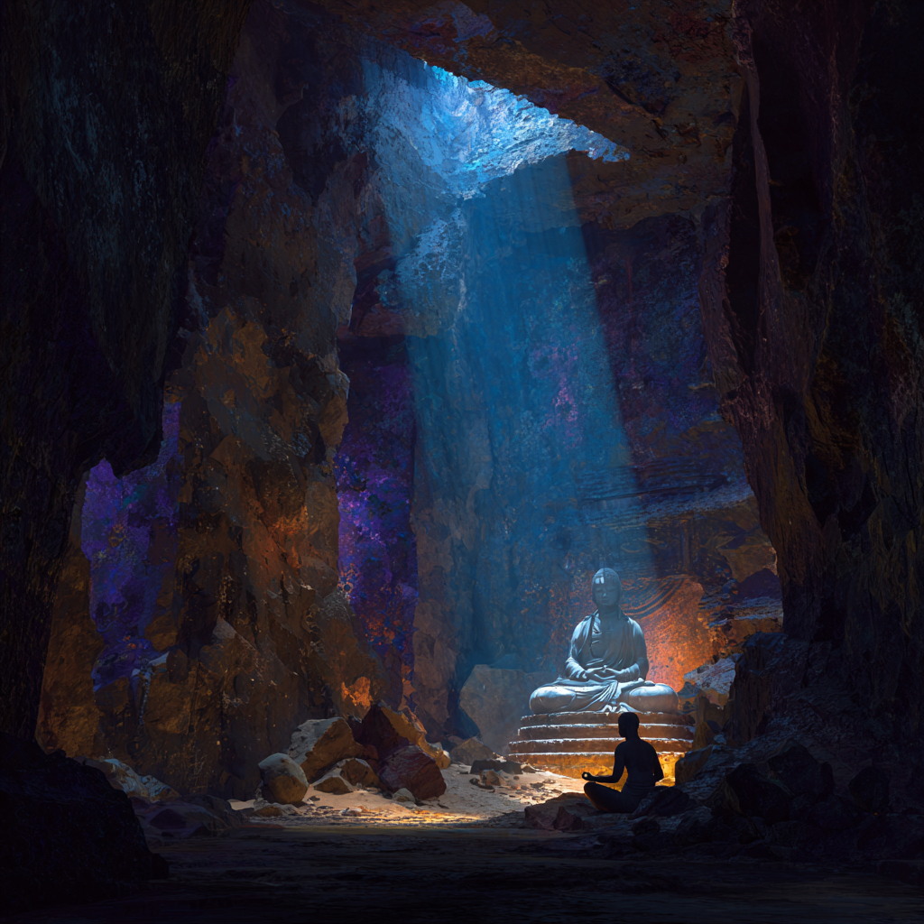
Chakra & Energy Healing Resonance
Deep Umber with Veiled Indigo Undertones
This color holds a liminal frequency—operating at the meeting point between grounding and inner vision. Energetically, it bridges the lower stabilizing chakras with the upper perceptive centers, making it uniquely suited for deep healing work that involves safety, shadow integration, and intuitive clarity.
Primary Chakra Activation
Root Chakra (Earth Star + Root)
The deep umber base strongly resonates with the Root Chakra and Earth Star Chakra, anchoring the body into physical safety, ancestral memory, and embodied presence. This color supports:
- Nervous system regulation
- Trauma grounding after emotional or spiritual work
- A sense of containment and protection
- Reconnection to the body after dissociation or overwhelm
Unlike brighter browns, this near-black umber works at a subterranean level—ideal for healing themes related to survival, fear, scarcity, and inherited patterns held in the body.
Secondary Chakra Influence
Third Eye & Veil Chakra
The veiled indigo undertone subtly activates the Third Eye and Veil Chakra (the perceptual threshold between seen and unseen). Because the indigo is muted rather than dominant, it encourages quiet perception rather than overstimulation. This supports:
- Shadow awareness without emotional flooding
- Inner seeing rooted in reality, not fantasy
- Intuition that feels grounded and trustworthy
- Safe exploration of subconscious material
This makes the color especially powerful for people who are intuitive but need stronger grounding—or for grounding practices that still honor spiritual sensitivity.
Energetic Function & Healing Themes
This color functions as a container frequency. It does not push energy upward or outward; instead, it holds space. In energy healing, this is essential for:
- Shadow integration
- Inner child and ancestral work
- Trauma-informed chakra healing
- Meditation focused on safety, stillness, and depth
Rather than “clearing” energy aggressively, deep umber with veiled indigo stabilizes it. Healing happens through quiet presence, not force.
The Core Elements of Deep Umber with Veiled Indigo Undertones
When I think about this color, I focus on what gives it its presence. Umber in its natural state is dark, rich, and rooted in nature, much like the soil beneath a shady forest. The touch of indigo adds a hidden coolness, subtle enough that it’s only noticeable when the light hits just right. The result is a deep brown that skews toward cool rather than warm, thanks to the veiled indigo that switches up the mood.
Understanding a color like this is really helpful if you want to use it intentionally. The name alone can sound fancy, but breaking it down makes it approachable. Umber comes from clay that contains oxides, giving it a rich brown tone. Indigo has long been used as a dye and is known for its moody, blue-violet color. “Veiled” here suggests that you’re not looking at a bright blue or violet; the undertone is more of a gentle suggestion, not a shout.
This blend creates a shade that can look pure brown, almost black, or unexpectedly blue violet, depending on the lighting. That’s why artists and designers are often drawn to it; it offers both stability and intrigue in one package. In projects, I’ve noticed that the complexity of this color keeps it from looking flat. The subtle blending of undertones lets it play off natural light in ways that are truly unique. No wonder it’s become a secret weapon for creating depth in a palette.
How This Color Looks and Responds to Light
Sometimes a color can switch up dramatically based on the lighting, and deep umber with veiled indigo undertones is a perfect example. In rooms with warm or indirect light, the brown comes forward and wraps the space in a cozy darkness. Under daylight or cool white lighting, a violet blue shadow starts to peek out, giving the color an inky, cool quality. In low light, I notice it sits just a step away from true black, but never flat or lifeless.
To my eyes, this makes it a flexible choice for anyone looking to introduce both drama and subtlety. Instead of reading as one note, the color seems to switch up throughout the day. It has the earthiness of freshly turned soil, with a twist that adds modern coolness rather than old fashioned warmth. In open spaces with natural light, the indigo undertones become more noticeable; in lamp lit corners, the room feels secure and sophisticated. If you enjoy colors with a bit of surprise, this one truly delivers.
Ideal Uses: Interiors, Art, and Design
After working with this color in various projects, I find it especially effective as an accent in interiors. I love how it turns an ordinary wall into something richer and more intimate. It works beautifully behind a headboard in a bedroom, giving a restful and enveloping feel that encourages winding down. I’ve also painted cabinetry with it, where the undertones give extra depth to what might otherwise be a plain brown. In creative studios, this shade fosters focus and a sense of retreat from daily distractions.
If your style leans cozy but you want something less predictable than navy or basic black, this shade does the trick. Pairing it with creamy whites and light grays helps keep things balanced and avoids an overly heavy look. In design, I use it for backgrounds or text highlights when I want a sense of reliability but also a shot of unexpected color. From furniture to artwork backgrounds, its versatility is undeniable.
- Mood Creation: Perfect for crafting intimate, moody rooms or creative studios where focus and calm are priorities.
- Contrast: Provides depth behind lighter furnishings or artwork, making bright colors pop without the starkness of pure black.
- Versatility: Works with a wide range of neutrals, even deep jewel tones, thanks to its blend of warm and cool elements.
Color Psychology and Energy Effects
I find color really influences how I feel in a space, and deep umber with veiled indigo undertones is no exception. The brown base often brings thoughts of earth, stability, and comfort. When I spot the indigo hiding beneath, it brings a sense of quietness and introspection, almost meditative, making it great for relaxation spaces.
This vibe can be useful for those who want to create areas that feel grounded and nurturing but not dull. Some people who practice color healing or energy work even use shades like this to encourage a mix of root chakra support (grounding) and third eye energy (intuition), since it bridges earthiness and depth. It’s fascinating how this color can nurture both restful reflection and a modern, sophisticated energy in the same space. A few candles or soft textiles in these tones can enhance this vibe even further for those who want to set a calm mood.
Mixing and Matching: Palette Ideas
Since the undertones can switch up in different lights, it’s important to test the color next to materials or shades you already have. Here are some combinations I recommend for different effects:
- With Creamy Neutrals: Pairs well with soft, creamy whites for a classic, understated look. This keeps things from getting gloomy and highlights the cool undertone.
- With Muted Greens: Looks great next to sage or olive, especially in living spaces or kitchens. The deep umber pulls out the warmth, while the indigo hints play with the green for a bit of drama.
- With Cool Metals: Silver, pewter, and matte black accents emphasize the coolness of the indigo and modernize the overall look.
- With Blush or Rose: Adds a cozy, romantic feeling when paired with muted pinks. Here, the brown base keeps things grounded, so the combination won’t look too sweet.
- With Warm Woods: For a natural, organic feel, pair with light oak or walnut. The mix creates a laid back elegance.
Mixing in textures, such as velvet or linen, can further bring out different qualities of this shade. Try using deep umber with veiled indigo undertones in throw pillows, rugs, or as part of an abstract painting for pops of color that still anchor a space.
Things to Think About Before Using Deep Umber with Veiled Indigo Undertones
It’s easy to fall for how rich this color looks in a sample, but there are a few things I always double check before committing. First, the size and lighting of the room really matter. In smaller rooms, especially those without much natural light, this shade can make the space feel even smaller and moodier. That can be great for a bedroom or cozy reading nook, but not ideal if you want an open, airy effect. For larger, sunlit rooms, the effect is less intense and can actually give a sense of sophistication that never feels overbearing.
The finish also makes a difference. A matte or eggshell finish keeps this color sophisticated and hides imperfections, but a subtle satin can pick up light and show off the indigo undertones when the sun hits just right. If you are painting furniture or cabinetry, a satin or semigloss finish is easier to clean and can be used for more impact.
Here are a few practical tips I’ve picked up from using this shade:
- Sample First: Always test a swatch on your wall or material in both daylight and at night before using it across a large surface.
- Balance the Darkness: Add plenty of lighter elements, such as rugs, drapes, or trim, in your room to keep the look fresh.
- Mind the Undertones: Some lightbulbs can bring out the cool or warm side of the color more, so check your existing lighting before finalizing your choice.
- Consider Usage: If you like to change decor regularly, try this color in accents first before painting large areas.
Finally, remember that deeply pigmented colors can take extra coats to get an even finish. Make sure to use a high quality primer or consult with a paint expert if you want the truest version of this shade on your walls.
Frequently Asked Questions
Question: Does this color work in small spaces?
Answer: I find that it can look really good in small rooms if you embrace the moodiness. It’s a strong choice for a powder room, cozy study, or bedroom where you want an enveloping effect. Just make sure to add lighter accents and good lighting to avoid closing in the space too much.
Question: How do I avoid the room feeling too dark?
Answer: Balancing with lots of lighter colors and reflective surfaces can really help. Think white trim, pale wood, mirrors, or metallic accents. Good natural light or layered lighting, including floor lamps and sconces, also makes a big difference.
Question: Is this color trendy or timeless?
Answer: I’d say it walks the line. The brown base is a classic, but the indigo undertone brings a modern twist. It feels stylish but doesn’t lean heavily into short lived trends, so I expect it to have staying power in both art and interiors.
Question: Can I use this color on exteriors?
Answer: Yes, but it may show less of its nuance outdoors unless the lighting is just right. It’s a striking choice for front doors, trim, or accent walls outside, especially if paired with lighter siding or natural stone.
Why I’m Drawn to This Shade
I keep coming back to deep umber with veiled indigo undertones because it does something uncommon; it creates comfort without being expected and adds interest without relying on loud colors. Whether you use it in paint, textiles, or artwork, it plays well with other colors and lets details and shapes pop. It’s a go to color for me when mood and vibe matter, but I don’t want things to look heavy or old fashioned. The ever shifting undertones mean it never gets boring, even after living with it for a while. Sometimes, friends walk in and ask, “What color is that?” and I know I’ve made a distinct choice.
Trying it out on a small area or accessory first is a good way to see how it feels in your space. With the right supporting colors, the result can be calming, modern, and just the right amount of edgy. I’m always glad when I’ve chosen it; I think those veiled undertones keep inviting a second look. If you’re looking to set a mood that’s both current and enduring, this color deserves a spot on your shortlist.